We’ve also created guidelines to help you use our brand and assets, including our logo, content and trademarks. To use any of our marks, please contact us via hello @digitalconfluence.info and provide details of your intended use of these marks.
LEADERSHIP
Here are several high-resolution photos of our executive leadership: Rowena Morais, Founder and Creative Director, Digital Confluence. These photos may be used for articles or speaking opportunities in which Rowena is involved provided written notification of such use is provided.
COMPANY LOGOS
The Digital Confluence marks include the Digital Confluence name and logo as well as any word, phrase, image or other designation that identifies the source of any of Digital Confluence’s services.
Do not modify the marks or use them in such a way that suggests sponsorship or endorsement with any other brand unless that has been agreed to in writing. For further information, please contact us at hello @digitalconfluence.info.
BRAND GUIDELINES
By using the Digital Confluence marks, you agree to follow these guidelines as well as our terms of service and all our rules and policies. Digital Confluence reserves the right to cancel, modify or change the permission in these guidelines at any time at its sole discretion.
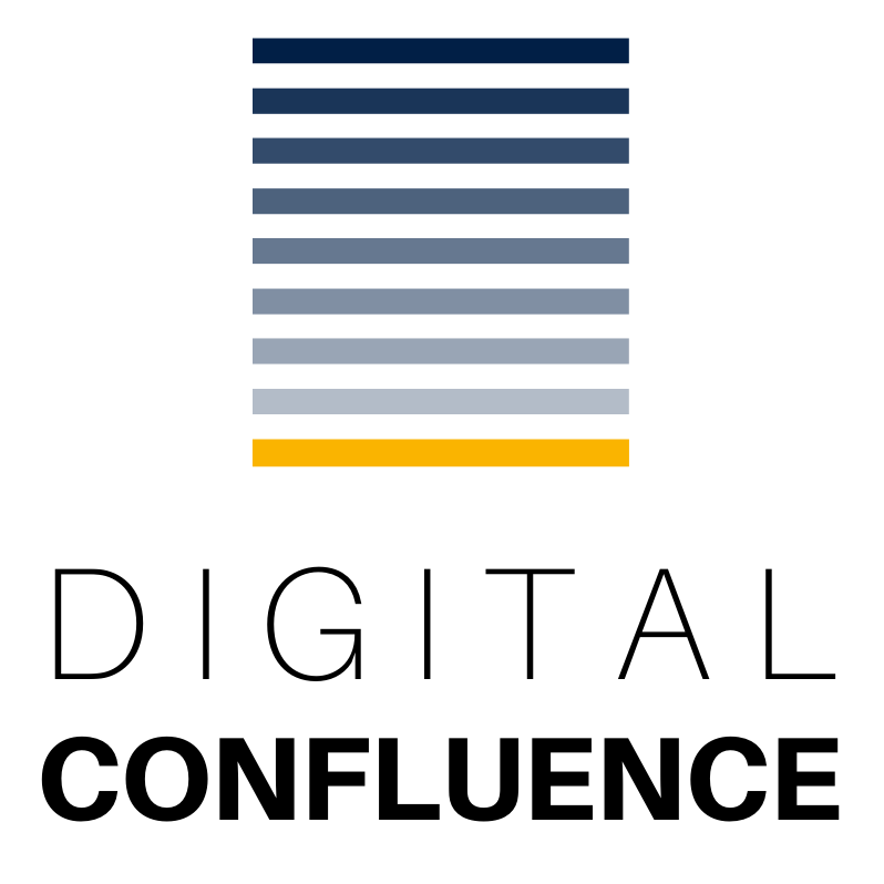
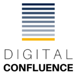
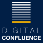
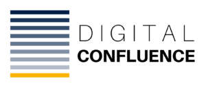
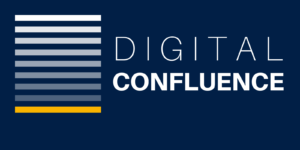
Design The Digital Confluence logo comprises a set of horizontal lines and a logotype set in Aileron Thin and Aileron Heavy. The square logo with a white background is the primary logo and should be used in most situations. The rectangular logo is for large-scale use. Always use the logo as provided, do not recreate or modify the logo in full or part, in any way.
Core colours Blue #011f46 Yellow #fab400 White #ffffff Black #000000
Logo misuse
Do not crop
Do not change transparency
Do not shuffle the colour or gradient
Do not use different colours
Do not change the size of position of the horizontal lines
Do not distort the logo, use any drop shadows or other effects
Do not outline the logo or rotate any part of the logo.