The Importance of a visual content strategy on LinkedIn
Written by Rowena Morais
You reach out to this impeccably dressed man, one you’ve heard so many positive things about. You’re excited to engage and get to know him better. You’re curious, naturally. And it’s a limp handshake. You’re slightly rattled by this.
Here’s another one. You’re meeting someone at a business luncheon and throughout the conversation, something’s not sitting right with you. Your eye keeps getting drawn to how rumpled his shirt is and the small food stain on the front of his shirt.
“You don’t get a second chance to make a first impression,” says James Uleman, PhD, a psychology professor at New York University and researcher on impression management. The good news with a face to face interaction is that despite the ways things can go wrong, you’re there in the flesh and in the moment to perceive reactions and subtleties and take action on the spot. You can correct, redirect and minimise.
But what about people who are meeting you for the first time in a digital context, such as by viewing your LinkedIn profile? Where is your opportunity to perceive a reaction or make any correction in real time? The circumstances are different, and for this reason, it is important to focus on how you can put your best foot forward with your profile.
A visual content strategy for LinkedIn and why it matters
Simply put, a visual content strategy requires you to have a plan, a considered approach to all the visual elements of your LinkedIn profile. Granted, LinkedIn is not built like Instagram, thanks to a focus on text-based content. But through the years, there has been a rise in visuals, videos and LinkedIn Lives on the site.
Visuals are powerful when done well. As there are specific areas within LinkedIn that you can incorporate them, you should.
According to Brain Rules by John Medina, when people hear information, they’re likely to remember only 10 percent of it three days later. But if this is paired with a relevant image, people retain 65 percent of the information three days later. People are visually oriented.
Visuals, in general, have such power simply because of how humans are built.
Visuals incorporate colour which can spark a range of emotion. Cool colours often spark feelings of calmness whereas warm colours could spark a range of emotions from comfort to even anger. Visuals increase the desire to read the content associated and can generate curiosity about what is discussed. According to a white paper, by e-commerce provider Invodo, about 57 percent of consumers said that product videos make them more confident in a purchase and less likely to return an item, up from 52 percent a year ago.
Visuals, in general, have such power simply because of how humans are built. So when visuals are well-thought out, planned in terms of clear outcomes and aligned to the text content, visuals have the power to carry the narrative forward and strengthen it. They break the monotony of text and build trust and credibility.
Understand that there are different types of people out there. Some are more comfortable processing ideas by listening, some by reading and others by watching. The more that you are able to accommodate these differences by incorporating a range of formats for your content, the better your chances of conveying your message effectively.
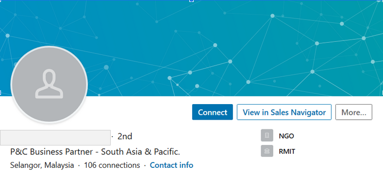
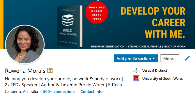
Take a look at these two LinkedIn profiles below. Notice the differences and how you are reacting to both. You will see how important visuals are to creating the desired perception.


There are a few types of visual content that you can publish on LinkedIn such as images, videos, infographics and presentation slides. These can also be embedded in different areas within your profile. Some stand out more than others which is important to consider when developing these pieces and knowing where you would like to place them.
These are a number of ways in which you can improve your LinkedIn profile through visual content and stand out for the right reasons. Below, I explore the specific features you can include as well as tips to optimise.
1. Put a face to your name
Every LinkedIn profile comes with the ability to include a profile photo.
- The ideal professional-looking photo is a head and shoulders shot. So it is best to avoid party shots, group shots where your image is cropped out, selfies or photos taken in a car. Also, avoid using sunglasses in your photo
- Pay attention to photo composition which means the arrangement of the different elements of the photo. It is how you put things within the frame to make it interesting. Think about your choice of backdrop, choice of colour, the possibility of too many elements that crowd or distract or conversely, are too bleak or bland
- Pay attention to distance. If the subject captured is too far from the lens, it is hard to make out their features. The reader may be prompted to wonder why this is the case. If you are too near, the photo may look off balance
- Look up the image size recommendations for LinkedIn to ensure that your images appear as you intend and are not cropped off badly when uploaded. This is especially relevant where your images contain text
- Investing in a professional photographer is highly recommended and the results can be used for a good number of years
- If you decide against a professional photographer, ensure that your camera settings capture the highest resolution possible. While a high resolution photo can be cropped and resized without compromising quality, a lower resolution image cannot be enlarged well
- Ensure you have good lighting for the shoot. Daytime is preferable but take care with this as outdoor light needs to be controlled. Harsh light can cause squinting as well as cast shadows (where shadows fall may impact image quality)
- If you are not comfortable having your photo taken, experiment with a few different poses till you arrive at one you like. Try standing, sitting or leaning. Consider arm placement and whether your face is tilted too. Take a few photos and examine them so you know how you’d like to make necessary adjustments
- Remember: first impressions matter. Be confident. Give yourself a pep talk prior. Smile. Feel the energy you are creating and put it out there.
Consider adding a call to action. This is a short phrase that tells the reader what action you’d like them to take (instead of expecting them to know).
2. Leverage your background photo for greater impact
This is a large space for a visual and it sits behind your profile photo. This is prime digital real estate.
- Avoid settling for the default blue LinkedIn background image and take advantage of this compelling feature. Let the visuals you use here carry your primary message forward
- Consider ways in which aspects of your work could be showcased in the visual – speaking at a conference, a book you authored or perhaps an award you have received
- If there are particular keywords you support or which form part of your agenda, incorporate them in your visual
- As with your profile photo, pay special attention to the size recommendations
- Be aware of how the profile photo is placed against the background image when viewed on the desktop (profile photo is left aligned) and on mobile (profile photo is centred). Knowing this enables you to make adjustments to copy placed in your background image
- Consider adding a call to action. This is a short phrase that tells the reader what action you’d like them to take (instead of expecting them to know). Examples include asking the reader to subscribe to your newsletter, reach out via email or visit your website.
- Do not feel beholden to the image you have uploaded. Feel free to rotate a few different images throughout the year. This could be done based on career changes, events you may be involved in or other topical messages you want to share.
3. Pretty up your posts and articles to catch the reader’s eye
Every post or article written on LinkedIn allows for the inclusion of images or videos. This is powerful for pulling the reader’s attention in a crowded space and especially useful as readers tend to scan content.
- A good image is aligned to the content in your article or post. It should support or amplify the primary message
- Incorporating good use of colour, appropriate choice of image and easy to read fonts all contribute to create an impression about the article and author
- In many cases, when dealing with complex or technical topics, the incorporation of a graph, diagram, pie chart or infographic can extend the piece and help the reader grasp the ideas presented. In this case, the image becomes an explainer
- Given that many are doing much of their reading on-the-go and on mobile devices, readers have a tendency to scan an article (rather than read it from start to finish). Therefore, a good image pulls the reader in and gets them curious
- It goes without saying that the images you include should be high quality. Otherwise, they will have the opposite effect of turning the reader off. When selecting stock images or creating a composite image, consider your audience, the industry you’re supporting and what you believe will resonate with them
- Do not feel you have to incorporate stock images for each post. Sometimes, the best way forward is to create a template for all supporting images. This means creating a colour scheme and plan for how every supporting image you use to headline an article is presented. A template and theme means building a brand around your posts so it is instantly recognisable.
4. Showcase your work experience and accomplishments
Both of these features in your LinkedIn profile allow for the inclusion of images, links to external websites or videos. Accomplishments is a big section which contains a number of sub-sections such as publications, courses, projects, honours and awards as well as organisation.
- Descriptions of your work or projects can be extended or reinforced through images, diagrams or videos. These enable the reader to get a deeper understanding of your expertise and experience as well as the scope of your work
- There are bound to be aspects of your work that can be showcased. Some of these questions may help you determine this: How can I show the scope of what I can do? How can I make my skills and experience more tangible? What would my reader be interested in?
- If there are aspects of your work which you believe cannot be shared for copyright or confidentiality reasons, there are still ways around that. Consider developing a new document that can showcase your learning without compromising sensitive information. Think first and foremost about your reader and what you need them to understand about you. Your reader will be less concerned with the confidential details of your situation and eager to see how they can learn from you. Understand also that your reader may arrive at your profile cold (with no prior background information or context). Therefore, provide relevant information that adds the much needed context to what you share
- Publications – even if you have not been invited to write for a media outlet, there has been a growth in the number of industry websites and niche blogs. And often, if you’ve got something interesting and useful to share, they would welcome a guest post. This means that, with some effort, you can be published.
- Projects – this is a broad category which can include a host of both work, volunteer and other types of projects you may involve yourself in. Incorporate storytelling in describing your project and share pictures or videos where appropriate. This is especially relevant if the project highlights other skills you have that are not visible in your work experience.
5. Highlight expertise in Featured Media
‘Featured’ is a section of your LinkedIn profile that sits below your ‘About’. There is scope to add media such as photos, documents or presentations. There is also scope to add a post or article you have written on LinkedIn, which is particularly valuable if the post has gained significant engagement.
- Newspaper articles, guest blog posts or podcast interviews are all possible additions that can strengthen your profile
- Consider the audience you are building, the industry you choose to support and what you believe will resonate with them. Use the opportunity of highlighting worthwhile media here as not everyone will review your profile from start to finish
- Remember that you do not need to wait for an invitation to speak to develop materials. Develop something useful and get that published to increase your visibility
- Review past speaking engagements and how you can leverage them. Perhaps with the inclusion of photos or videos taken at the event or slides from a presentation delivered
- Think about a topic you can speak on. Develop media you can publish ( a two minute video or a set of slides).
6. Carousel posts are amazing
Carousel posts have become increasingly popular and a wonderful inclusion because of the visual aspects. These posts comprise multiple images (that could also include videos or a combination thereof). Readers go through the posts by swiping through.
- It is a creative way to get more content into a smaller space. It enables you to show before and after images which is great if you have a product you want to talk about.It helps your reader see how your product can be used
- A succession of images can also be used to tell a story – it can build suspense and engagement.
7. The little details
Finally, pay attention to the tiny things that come together to create a flawless profile.
- Take the company logo, for example. When a company is present on LinkedIn (through the company’s LinkedIn Page), you can pull up their name (and their logo) when you add the company in the work experience section. This makes your work experience area look visually interesting and complete. If the company is not on LinkedIn, then the default placeholder image will be seen
- Your current company and education are also visible next to your headline which sits right at the top of your profile. Again, inclusion makes it visually complete.
As you can see from the above, there are many ways to stand out professionally with a visual content strategy. Take control of your personal identity so that you can present a truer picture of who you are to the world.
This article is part of a series of articles – Optimise Your LinkedIn Profile.
